Credit Sequences Research
Whilst researching films for my project I took notice of the copious components that go into making a good credit sequence and how to determine which components should be used. I saw how different fonts helped emphasize aspects of the film, like more comical fonts would signify its going to be a non- serious production and should be taken lightly. Moreover, the use of movement for each sequence drastically differs in accordance to what producers are trying to accomplish.
The Haunting (1963)
This particular film has a credit sequence on top of a series of images instead of a preview of the film. I noted that all the credits were centered on the screen but that before the title appeared the names were higher on the screen and afterwards, they become lower. The title appearing in the middle of the sequence is more remarkable than, for example, at the end or beginning. My favorite aspect of this sequence was the font, I thought it did a good job at portraying how rigid the film itself is and serves almost as a warning. Truthfully after watching this sequence I didn't feel enticed to keep watching because in my opinion the font and editing seemed a little childish to me though I know its due to how old the film is.
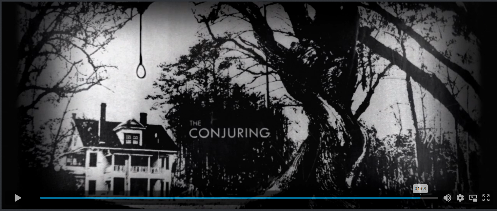
The Conjuring (2013)
This credit sequence is much more interactive than
The Haunting in the sense that there's much more movement throughout and it has a more organic feel. By organic I'm referring to the fact the credits looks like they are being projected onto a screen and every so often you can see the shadow of a hand. Not to mention that the credits are incorporated very strategically by making them seem like parts of articles, newspapers, and posters, but emphasizing them by making them bold. This clever placement of the credits makes the audience feel like we are watching an undergoing investigation. The actual title of the film appears in the end of the sequence to allow the audience to know it will begin shortly after.
Midsommar (2019)
This film shows nothing but the credits and flowers. I thought is was very clever how
Midsommer's editors used the actual names to create movement within the scene. Another aspect that was remarkable for me was the use of flowers to foreshadow some themes that can be seen through the movie. The titles appear centered on the screen when they are singular or duos, at a certain point the producers simply added full run downs of both cast and crew and these images stay on the screen for long periods of time. Everything to this point is in black and white with the exception of the flowers further highlighting that they will be important further on. Like
The Haunting, the actual title of the movie appears in the middle and flows very well with all the other text.
Based on all that I've learned I realized I want my credit sequence to incorporate movement because it is more visually interactive and can be a good tool to keep audiences engaged. Additionally, I loved how both Midsommer and The Conjuring both included elements that serve as hints to what the film is about. Regarding the fonts and placement of the text, I want to use a more professional font because my film will be centered around a serious topic and should not be taken lightly.


No comments:
Post a Comment